
The Basics of Painting and Decorating
Success in house decorating is a combination of good paint, a certain amount of skill in its application and an understanding of the materials employed.
The biggest step is deciding on your colour scheme! Be flexible, the end product is a combination of decisions made as you see your work develop, so you don’t have to stick to the ground plan. Try and work tidily to reduce dust, keep a record and make notes of paints used for reference should you want to repeat the effect at a later date.
Buy the best tools you can afford, especially paint brushes and good quality paint. Buying cheap paint is often a false economy as many more coats are usually required so follow the manufacturer’s instructions on tins. Try to ensure that you have bought enough materials to complete the job. This is essential when buying wall paper and paint because of any variance in colour between batches.
Painting Interior Walls
First, remove as much from the room as possible leaving everything that remains in the middle of the room. Complete all your preparation before you start to decorate. Don’t rush the job. Always paint the ceiling before walls or woodwork. Start with the ceiling.
Interior walls are normally painted with either matt or silk emulsion paint. Matt is better to use if the walls are uneven as the sheen of a silk finish shows up every small imperfection.
Using a roller: The usual way to paint walls when using a roller is to cut in with a brush along the ceiling line , the corners, round the architrave, skirting board and around the sockets and switches before using the roller. Cut in one large section along the ceiling line down the corner and along the skirting line. Make the strip half a roller width so you do not have to go too close to the ceiling or skirting with the roller. Roll about a metre square at a time. If you want a solid coat on the walls / ceiling then roll about a metre square at a time. When you have rolled the third metre then go back and re-roll the first metre without putting more paint on the roller. This distributes the paint more finely and helps remove the orange peel effect a laden roller will inevitably leave. This is particularly valuable if you are planning to apply a paint effect over the surface as the base coat will need to be as smooth as possible.
Start in a top corner and work away from the main source of light. When applying a paint effect it is advisable to begin on the most broken wall thus leaving the dominant wall till last when you will have settled into the method.
When using a brush do sections about one square metre working from ceiling to skirting. Of course, the advantage of using a brush is that the cutting in is much easier!
Factors That Influence Colour
Each colour is perceived only in relation to the colours surrounding it - the visual effect one colour has on its neighbour.
Daylight creates light and shadow areas on an interior wall, affecting how we see that colour. Artificial lighting can actually affect the appearance of a colour generally softening it.
A strange phenomenon is that a colour like red ( yellow, orange ) will appear closer and blue (violets, and greens) appear further away. This will be of importance in a long narrow room or a low ceilinged room say where you should avoid a foreshortening effect.
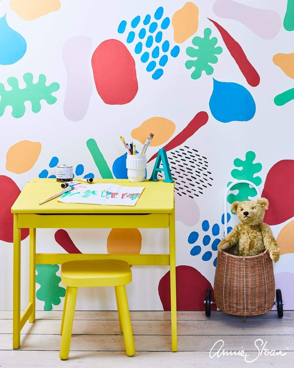
Some Colours that Combine well Together
Yellow: Deep blue, deep red, grey and pale ochre.
Pink: Sombre tones of green and blue and some ochres.
Terracotta: Cool blues, greys, yellows and olive.
Blue: Greys, pinks, reds, some greens ad off whites, orange / red and golden ochres.
Reds: Dirty green, gold, blue and off whites such as grey.
Green: Deep reds, russets, greys blues and pink.
Choosing a Colour Scheme
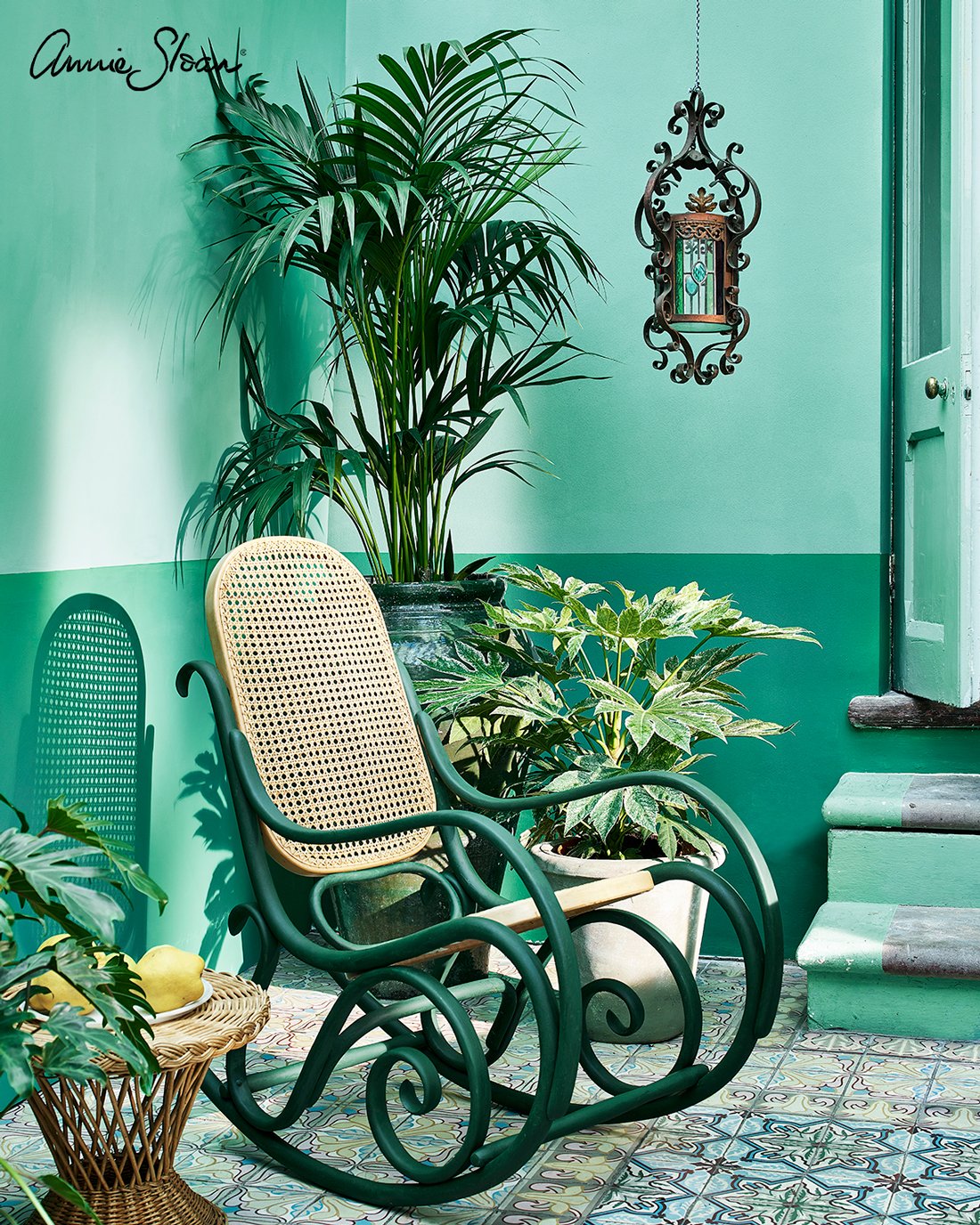
Monochromatic Scheme: The use of one colour / hue and varying its tone and intensity into dep tones, mid tones and highlights. This can be embellished by varying the textures used eg stone, brickwork etc. Quite often highlights of a contemporary colour are used as well.
Primary Colour Scheme: Where strong primary colours are used often set against white or diluted by an adjacent colour
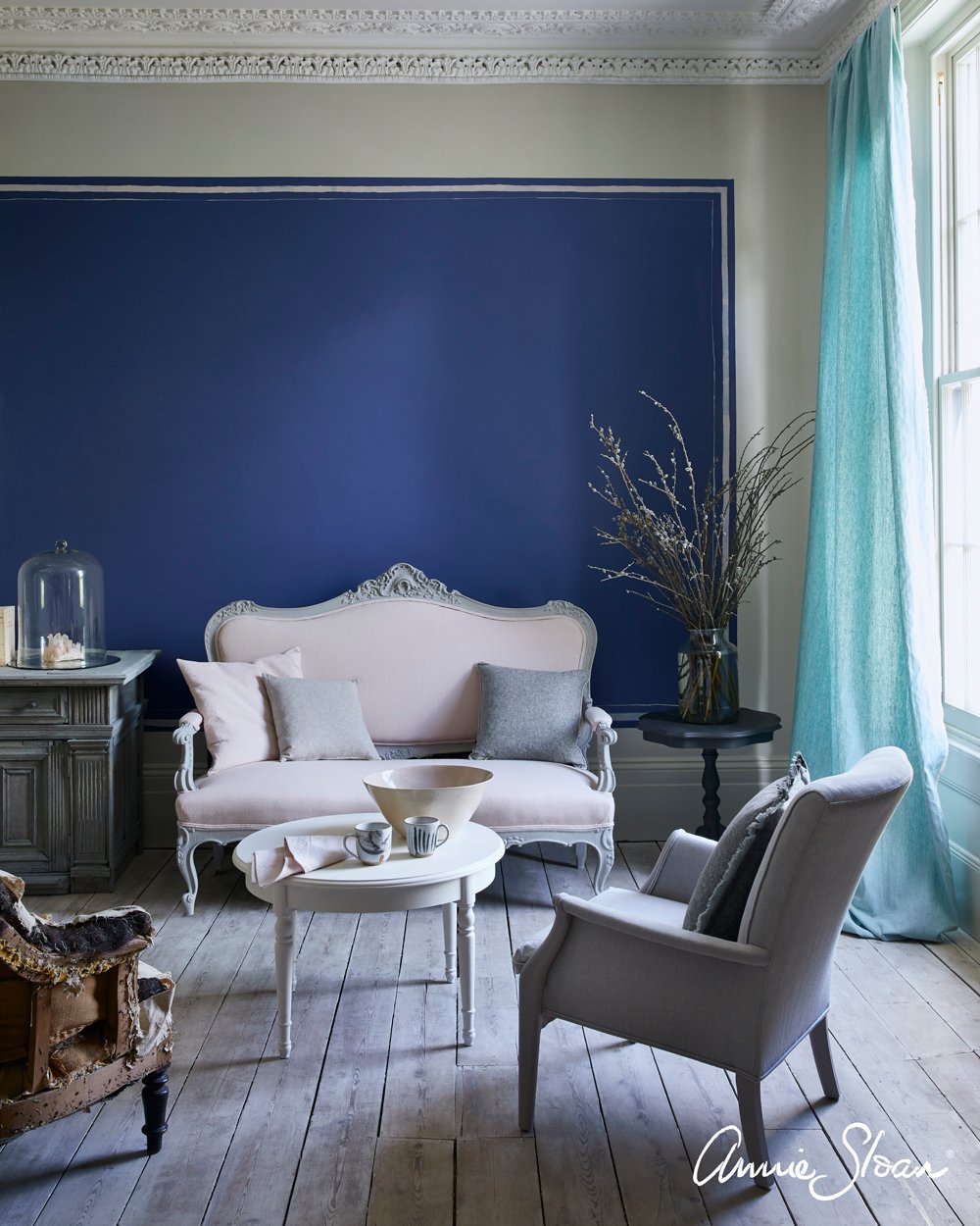
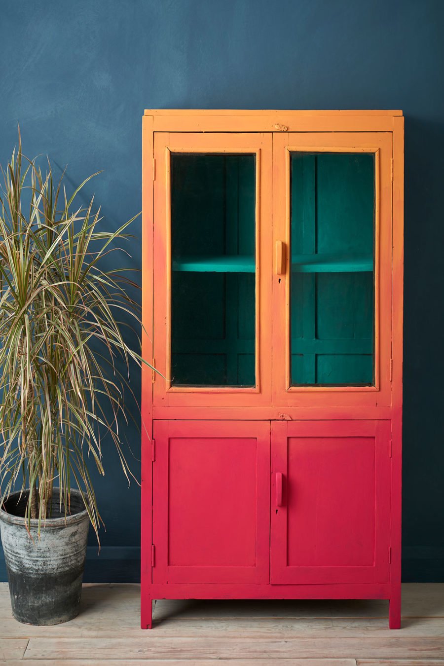
Complementary Colour Scheme: Pairing opposites on the colour wheel. Use the cooler receding colour for the large areas and the advanced colours for smaller areas. You can vary the tone and intensity to create a variety. Such as red / green, blue / orange , crimson / lime green.
Split Complementary Colour Scheme: Three colours only from the colour wheel are used. One colour and it two adjacent colours. Although the number of colours included in the wheel can be varied thus making more combinations possible. You can vary the intensity and tone of each of the colour so that one is strong and the other two muted.
Selecting a Colour Scheme
Your personal preferences - this seems obvious but is very important. After all it is you who will be living with the choice!
An object already in the room or a decorative item already there that will remain after decorating eg the floor covering or curtains.
Choose to suit the style of the building.
The function of the room: A sitting room used at night can be in stronger deeper colours whereas a child’s nursery might be better in quiet calm colours.
Sunlight: The number and size of the windows giving access to daylight and how the sun comes in. Small dark rooms can be made to feel much lighter by using pale reflective colours.
All photography with thanks to Annie Sloan
ANNIE SLOAN’S TOP TIPS FOR HOW TO APPLY A WALL PAINT SAMPLE
Don’t paint colours too close together. As Annie frequently preaches, using different colours in close proximity will highlight different tones within those colours. While this is very useful when building a palette, it can be distracting and confusing when you’re pairing two similar shades together to see which you prefer.
1. Observe in different lights. Make sure to review how the colour looks first thing in the morning, in the afternoon, and once darkness falls.
2. Paint patches on different walls. If you’re intending to paint an entire room one colour, you will want to see how the shade you choose works in darker corners as well as on window-facing walls.
3. Create a room or home scheme by drawing a floorplan then painting testers on to the paper to get a real feel of how the new colour refresh in one room will impact the rest of your home.
4. Make sure your test areas are a decent size, we recommend that they’re at least 30cm x 30cm. One of our 120ml tester size paint tins will cover just over 1.3m squared.
5. Take photographs. How your interior looks on camera is increasingly important. This will also help you to review and compare different colours during the selection stage of the process.
For even more info on painting why not follow Annie Sloan’s blog. This is where we found this advice about painting samples by the way!